User Experience 02 - Introduction and Research
 |
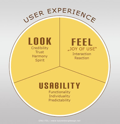
| What makes a good user experience? Source: WikiMedia |
- An animated video or infographic explaining the process of the weekly tasks on the website, from checking the semester calendar to undertake the current week's task, to completing the declaration, and all that comes in between.
- Refining the information currently on the website into user friendly chunks of information. The presentation may use the 'cards' feature that is currently in use on the website, and adapt it to the new presentation.
- Creating a brand identity for the website using the current domain name as the brand name. As this is the least useful to the websites users (although still an important part), it will be left to later on.
An important part of UX Design (among other things) is research. The purpose of the website is to support students studying on the Creative Digital Media website. It is a hub that contains weekly tasks for students, links to publications and tutorials on various subject matter, and access to current students writings on their progress. The three current courses to explore are: Intro to Digital Media, Multimedia Development 1, and Multimedia Development 2.
Immediately, we know that the target audience is college students. 18 - 24 is the age bracket used by the CSO when examining college students, so that is a good age demographic to call our target audience. According to some findings in the publication "Asking Students What They Think: Student User Experience (UX) Research Studies to Inform Online Course Design", the ability to find information quickly is more important than the aesthetic of the website. It is here that I think the current website does quite well for the most part. A lot of things are easy to navigate to. For instance, the Semester Calendar can be found immediately in the navigation bar. I will need to make sure that I do not undo any of the features that are already user friendly. The visual elements that I will add will make navigation easier at a glance, as well as make it easier for new users to navigate.
I began sketching some ideas for icons that may give the website a bit of flow. The aim is that the icons will alert the user to what kind of information they are about to receive. A book icon means a reading task, a paper and pen icon means a writing task, a game controller means a Unity task. Exclamation points would signal that this is a project task, and implies importance. A clock icon tells the user how long they should spend on this task. Message bubble icons could be used to link to the discussion channel in the slack workspace, and be laid out around the site to encourage engagement. A Moodle icon could link to the declaration page for the current task to save confusion between weeks and correlating the week numbers on the website with the week numbers on Moodle.
 |
| Some basic sketches of potential ideas. |
I believe that I have made good progress on this project so far. I adhered to the processes that I have learned so far in college, and refrained from jumping straight into an Adobe suite and creating things that may or may not need to be there. I must remember that I am not the User, and that only the research will inform me what steps need to be taken. In the next couple of weeks, I will draft up a survey to gain feedback on the current course websites. This will give valuable insight into what areas need attention, and what is currently working well.
- Ultan


Comments
Post a Comment